In this chapter, we present some common GUI elements provided by
the Fudget library. For more information, consult the reference
manual, which is available via WWW [HC97].
Before we introduce the GUI elements, we discuss briefly how
fudget programs are formed using the function fudlogue.
As we have seen in the examples in
ChapterĀ9, a fudget
program consists of a number of fudgets, combined in a
hierarchical structure that makes up one main fudget of type
F a b, for some types
a and
b. The main
program in Haskell should have type
IO (), so we need a
glue function to be able to plug in the main fudget. The function
fudlogue is provided for this purpose:
fudlogue :: F a b -> IO ()
The
main program of a fudget program usually
consists just of a call to
fudlogue with an argument fudget.
like
main :: IO ()
main = fudlogue the_main_fudget
However, it is possible to combine
fudlogue with other
monadic I/O operations. For example, to create a program that
starts by reading some configuration file, you could write
main = do config <- readFile config_filename
          fudlogue (main_fudget config)
Programs with graphical user interfaces need at least one shell (top-level) window. These are created with the function
shellF:
shellF :: String -> F a b -> F a b
The typical GUI program has only one shell window, and the main
program thus looks something like
main = fudlogue (shellF window_title main_gui_fudget)
A program with more than one shell window could for example look something
like
main = fudlogue (shellF title1 fud1 >==< shellF title2 fud2)
The fudget
shellF is not restricted to the top level.
You could write the above example as
main = fudlogue (shellF title1 (fud1 >==< shellF title2 fud2))
and achieve the same result.
We have already seen
labelF, which displays static
labels, and
intDispF, which displays numbers that can
change dynamically. There
is also
displayF,
displayF :: (Graphic a) => F a b
a more general display for dynamically changing values. It can
display values of any type in the
Graphic class. It
could in fact also display numbers, but
intDispF has the
advantage that the numbers are displayed right adjusted.
We have already seen
buttonF,
buttonF :: (Graphic a) => a -> F Click Click
in the examples above. It provides
command buttons, i.e.,
buttons trigger some action when pressed. The Fudget library
also provides toggle buttons and radio groups
(
FigureĀ10). Pressing these buttons causes a change
that has a lasting visual effect (and probably also some other
lasting effect). A toggle button changes between two states (on
and off) each time you press it. A radio group allows you to
activate one of several mutually exclusive alternatives. The
types of these fudgets are
toggleButtonF :: (Graphic a) => a -> F Bool Bool
radioGroupF :: (Graphic b, Eq a) => [(a, b)] -> a -> F a a
The input messages can be used to change the setting under
program control.
 | toggleButtonF "Run" |  | radioGroupF [(1,"P1"),(2,"P2"),(3,"P3"),(0,"Off")] 0 |
|
Figure 10. Toggle buttons and radio groups.
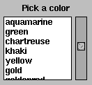
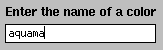
Choosing an alternative from a list is usually easier than
typing something, e.g., the name of a colour, on the
keyboard. But when there is no predefined set of alternatives,
you can use fudgets that allow the user to enter values from the
keyboard. The library provides
stringInputF :: F String String
intInputF :: F Int Int
for entering strings and integers (see
FigureĀ13). For
entering other types of values, you can use
stringInputF and
attach the appropriate printer and parser functions.
The library provides the fudgets
moreF :: F [String] (InputMsg (Int, String))
moreFileF :: F String (InputMsg (Int, String))
moreFileShellF :: F String (InputMsg (Int, String))
which can display longer text.(Footnote:
The names come from the
fact that they serve the same purpose as the UNIX program more.) The input to
moreF is a list of lines of text to
be displayed. The other two fudgets display the contents of file
names received on the input. In addition,
moreFileShellF
appears in its own shell window with a title reflecting the name
of the file being displayed.
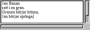
There also is a text editor fudget (FigureĀ14),
Figure 14. The text editor fudget editorF.
which supports cut/paste editing with the mouse, as well as a
small subset of the keystrokes used in GNU emacs. It also has an
undo/redo mechanism.